
Color plays a much bigger role in UI design than most people realize. It’s not just about aesthetics or branding—it’s about psychology. The colors you choose for your interface directly affect how users feel, think, and act.
From building trust to driving conversions, color psychology in UI design can make or break the user experience. In this article, we’ll explore what color psychology is, why it matters in UI/UX design, and how to use it strategically to create intuitive, engaging digital products.
What Is Color Psychology in UI Design?
Color psychology is the study of how colors influence human emotions and behavior. In UI design, it refers to using colors intentionally to guide users, communicate meaning, and create emotional responses.
When users land on a website or open an app, their brain instantly processes color—often before reading any text. This first impression shapes how they perceive your product, whether they trust it, and how comfortable they feel using it.
In short, color is not decoration. It’s communication.
Why Color Psychology Matters for User Experience (UX)
Research shows that people form opinions about a product within seconds, and color is one of the strongest contributors to that judgment. In UI design, the right color choices can:
- Improve usability and readability
- Increase user engagement
- Guide attention and actions
- Build brand recognition and trust
- Boost conversion rates
On the flip side, poor color choices can confuse users, cause visual fatigue, or make an interface feel untrustworthy—even if the product itself is excellent.
How Colors Affect Human Emotions
Humans naturally associate colors with emotions, memories, and experiences. These associations are influenced by nature, culture, and psychology.
For example:
- Warm colors (red, orange, yellow) feel energetic and urgent
- Cool colors (blue, green) feel calming and stable
- Neutral colors (black, white, gray) create balance and clarity
In UI design, understanding these emotional triggers helps designers create experiences that feel intuitive and emotionally aligned with the product’s purpose.
Meaning of Colors in UI Design
Let’s look at the most commonly used UI colors and how they influence users.
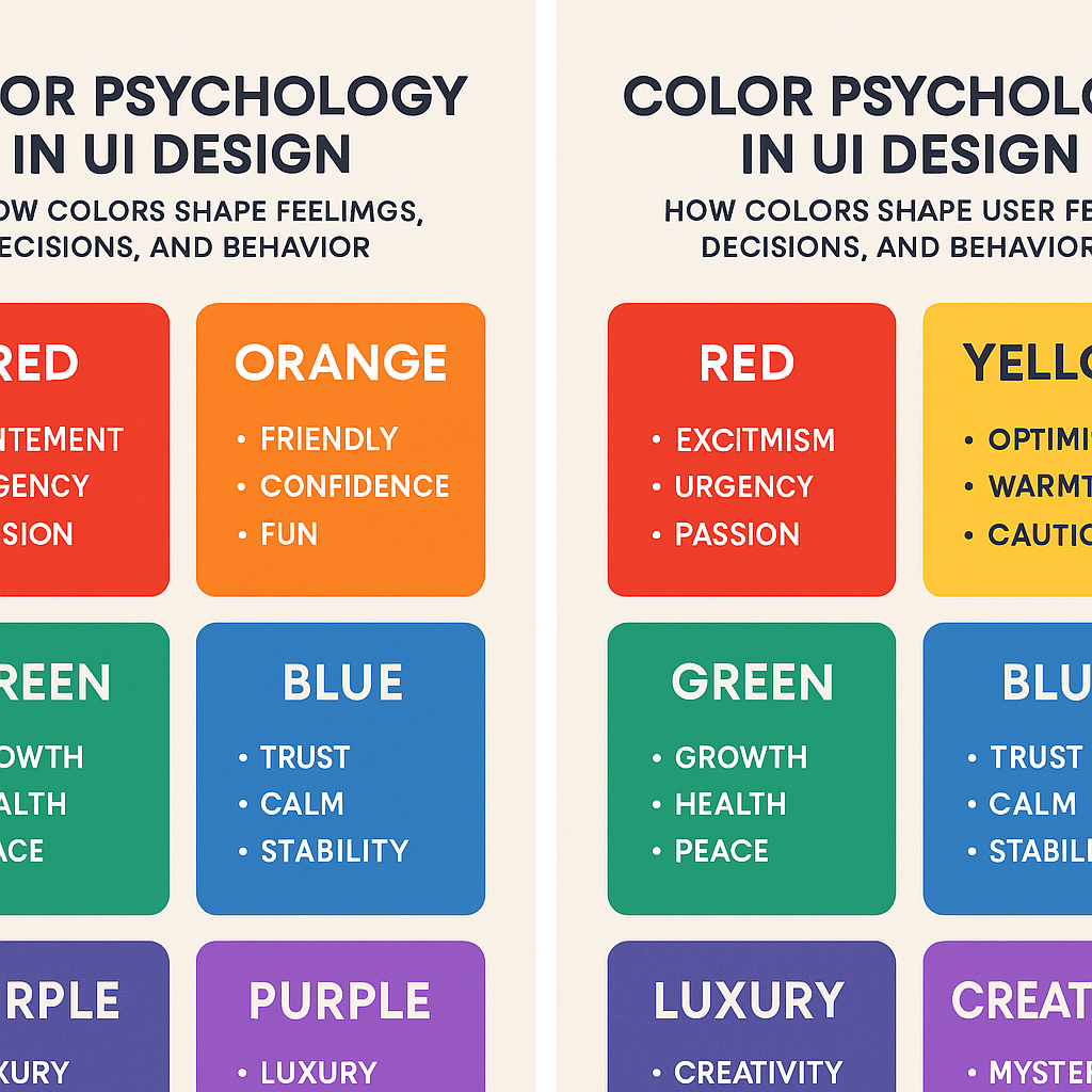
Blue: Trust, Security, and Calm
Blue is one of the most popular colors in UI and UX design. It’s associated with reliability, calmness, and professionalism.
Common use cases:
- Banking and finance apps
- SaaS dashboards
- Healthcare platforms
- Corporate websites
Blue helps users feel safe, which is why companies like PayPal, Facebook, and LinkedIn use it heavily. However, too much blue can feel cold, so it’s often balanced with warmer accent colors.
Red: Urgency, Attention, and Emotion
Red is bold and powerful. It grabs attention instantly and creates a sense of urgency.
Common use cases:
- Error messages
- Notifications
- Sale banners
- Critical call-to-action buttons
While red is effective, overusing it can increase stress or anxiety. In UI design, red works best as an accent color rather than a dominant one.
Green: Success, Growth, and Balance
Green is strongly linked to nature, health, and positivity. It is easy on the eyes and helps to maintain equilibrium.
Common use cases:
- Success messages
- Confirmation screens
- Financial and wellness apps
- Environmental or sustainability brands
Green often communicates “everything is working,” making it ideal for feedback and progress indicators.
Yellow: Optimism and Awareness
Yellow is cheerful and energetic, but it can also be overwhelming if used incorrectly.
Common use cases:
- Highlights
- Non-critical warnings
- Creative or playful interfaces
Because yellow has high visual intensity, it’s best used sparingly to draw attention without harming readability.
Black and White: Simplicity and Focus
Black and white are foundational colors in modern UI design.
- White creates space, clarity, and readability
- Black adds contrast, elegance, and authority
Minimalist interfaces rely heavily on white space to reduce cognitive load and guide users naturally through the interface.
Purple: Creativity and Luxury
Purple combines the calmness of blue and the energy of red, giving it a creative and premium feel.
Common use cases:
- Creative tools
- Beauty and lifestyle brands
- Luxury or high-end products
Used thoughtfully, purple can make a UI feel distinctive and memorable.
Cultural Differences in Color Psychology
Color meanings are not universal. Cultural context plays a major role in how users interpret colors.
For example:
- White represents purity in many Western cultures but mourning in some Eastern cultures
- Red symbolizes luck in China but danger or warning in Western regions
- Green can mean prosperity in one culture and illness in another
For global products, it’s important to research cultural color meanings and test designs with diverse user groups.
Color Accessibility in UI Design
Good UI design is inclusive design. Color choices should work for everyone, including users with visual impairments or color blindness.
Accessibility best practices include:
- Ensuring sufficient contrast between text and background
- Avoiding color-only indicators for important information
- Using accessible color combinations tested with contrast tools
An accessible color system improves usability and ensures your product reaches a wider audience.
Using Color to Guide User Actions
In effective UI design, color helps users understand what to do next—without instructions.
Examples include:
- A primary button color that stands out clearly
- Muted colors for secondary actions
- Consistent colors for similar functions across the interface
When users don’t have to think about where to click, your UI feels effortless and intuitive.
Build a Color System, Not Just a Palette
Instead of choosing random colors, successful products use structured color systems.
A strong UI color system includes:
- Primary brand colors
- Secondary and accent colors
- Semantic colors (success, error, warning)
- Clear usage rules
This consistency improves scalability, usability, and brand recognition over time.
Final Thoughts: Color Is a Silent UX Tool
Color psychology in UI design is about empathy, not trends. The best interfaces don’t overwhelm users—they guide them gently, build trust, and create emotional comfort.
When color is used intentionally, users may not notice it—but they’ll feel the difference.
Before choosing a color, ask:
“What should the user feel at this moment?”
That question alone can transform your UI design.